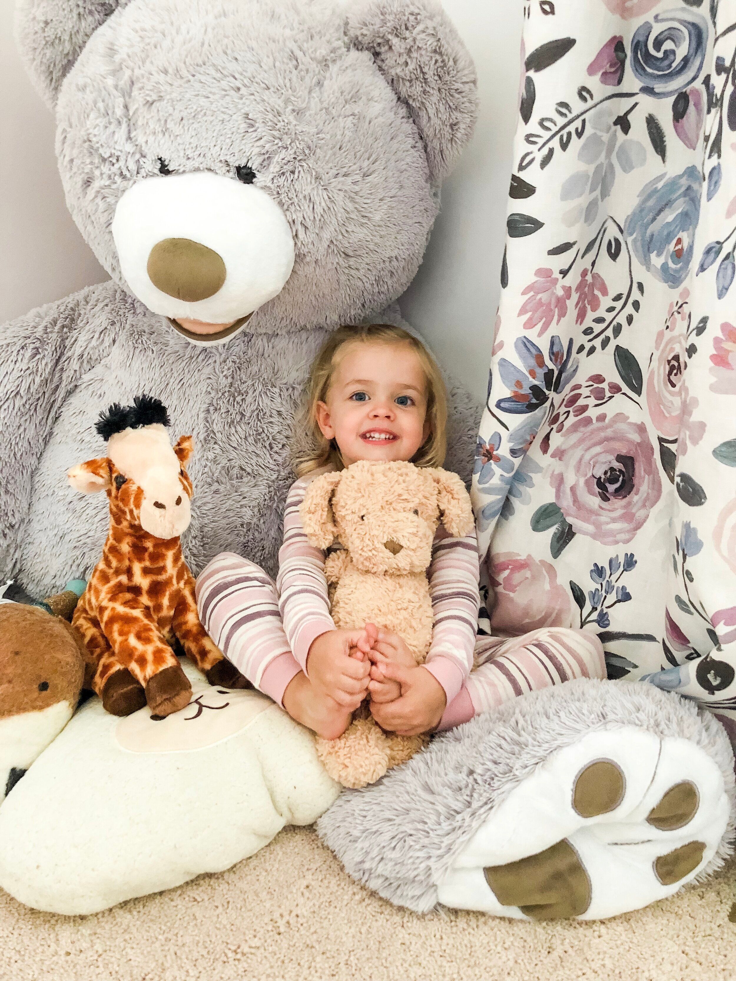
I think one of the most satisfying parts of my day as a mom is when both girls are tucked in tight in their beds. It makes me happy knowing they just got their baths so they are squeaky clean, and they are now in their snuggly soft jammies. I may be late to the party on this one, but one of my friends recently introduced me to Burt’s Bees Baby pajamas and I am in love. The organic cotton is so soft and the colors and prints they have for the fall collection are beautiful. I am loving all the blush pinks, mauves, and plum purples. The fact that they are two piece make them ideal for potty training. I’d love to pick up a couple for Naomi (they have baby sizes as well!) so the girls can match. Bonus points for the fact that they actually match Abigail’s room. I’ve picked out my top 5 favorite prints for fall and have linked them for you. Send me an email if you would like to get $15 off your first order of $75!


A Modern Farmhouse Laundry Room
I love utilitarian spaces in homes. However, often times, they are the most under developed spaces in our homes. Take the laundry room for example. Laundry is one chore that just never ends. A lot of time is spent in a laundry room and when it is designed thoughtfully, it can save us a lot of time and help increase the value of our home. Why not make it as efficient and beautiful as possible?
Here are some photos from a recent design client project where I made over the laundry room. The existing space had storage, but it didn't give them the right storage they needed (there was no room for the vacuum so it was always sitting out, etc.). The floors were laminate tiles that were starting to chip and crack in some areas. You could see the hookups to the washer/dryer from the kitchen and overall the colors needed to be lightened up. Here's a look at the before:


And, behold...the after!


We took out the old green cabinets and replaced them with navy shaker cabinets to tie into the color scheme used in the rest of the house. We used simple butcher block counters to bring in some warmth and a farmhouse sink was a given for this space. The cabinets hide the hookups to the washer and dryer as well as give the vacuum a place to be stored. The walls were painted a light gray and the floors were replaced with a really versatile and durable tile. We added some shelves on either side of the window to add a little interest. And, possibly my favorite addition to the space, are the gorgeous roman shades!
My online shop has some of my favorite laundry and cleaning items, so be sure to check it out so you can create an enjoyable space to do your laundry! Here is a link to my shop.
Nursery Inspiration
I am finally ready to share some of the inspiration behind the nursery for our baby girl who is due in July! I'm so excited to be taking you behind the scenes of how I am making my decisions and the overall direction I wanted to take.
Before starting any project, whether for myself or a client, I start by going through photos that I have saved as inspiration. I usually come across something on social media and take a screen shot of it for later use. The key here is to use a photo as inspiration that is not of interior design. I don't know about you, but I don't want to just copy what someone else has already created. Rather, I want something that is uniquely designed just for me and the goals I have for the space.
Speaking of goals, it's really important to keep in mind what are your overall goals for the space. For the nursery, I wanted it to feel serene, feminine, and elegant. This list of descriptives helps me to narrow down on my inspiration photo. I fill out this form to help guide me through this process:

I start out by listing some of the descriptive words that I want to be able to use when describing the space (in this case, it's the nursery). From there I paste in my inspiration photo. Keep in mind this isn't a photo of someone else's nursery. It's just a photo that I love and I think perfectly fits with the list of descriptives. Then I study the inspiration photo. I ask myself what I like about it. What textures are used? Do I notice any color schemes? Is there any contrast? Is it feminine or masculine or a little bit of both? Finally, I work on pulling colors from that image as a starting point for my color scheme. You'll want to keep in mind the basic principles of color theory which I wrote about here. More than likely, if the colors look good together in the photo then they will look good when pulled together in your space.
Any there you have it! This was the very first step I took when designing the nursery and I'm excited to share with you our progress along the way!
The Friday Five

For my second installment of "The Friday Five", I thought I would share 5 textile designers I am loving right now. I've talked about before how I love adding designer pillows to help elevate a space. You can save money on other items in a space, but when you can, designer pillows help take things to the next level. It was really hard for me to narrow down my list to just five designers, and this list is definitely not in order. Each designer has a different aesthetic, so it just depends on the overall look you are trying to achieve. So, here are 5 designers I am loving right now.
1. Caitlin Wilson Textiles

Caitlin has a very feminine yet sophisticated aesthetic, so when used in the correct way it can add a major dose of refinement to any room. Without giving away too much, I'll be using one of her prints for some custom drapes in our baby girl's nursery and I can't wait. The print is sophisticated enough to where it can "grow up" with our daughter as she gets older. Pair these floral prints with a more masculine geometric print and it's a match made in heaven!
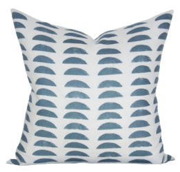
2. Zak + Fox

Zak & Fox has a wonderful variety of prints that have an "easy refinement" or a "cool California" vibe to them. They definitely err on the more masculine side, so they are perfect when paired with a floral print in order to achieve more balance. This pillow paired on a cognac leather sofa equals all the heart eyes!
3. Peter Dunham
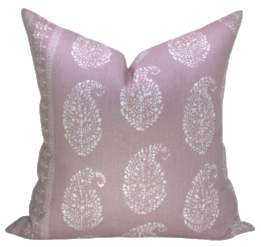
Peter Dunham has a wonderful selection of textiles with an aesthetic that gives you a "collected over time" look. Many of his textiles are inspired from his travels all over the world, so many of the prints incorporate cultural influences from all over. I just really love the fresh take he has on this lavender paisley pillow!
4. McGee & Co.

You can't go wrong with a simple grey stripe to pair with pretty much about anything else. The perfect grey stripe is harder to find that you would think, and this one fits the bill. I love a lot of their other textiles as well as many of their designs are fresh and modern. I've seen a sneak peek of their new collection coming out and you're not going to want to miss it. It's SO good!
5. Rebecca Atwood
When you go to Rebecca's site, you can read all about her design process. You will be absolutely blown away by the number of hours that are spent coming up with each design. I love this pattern because it is so unique, and the scale is just right to pair with a lot of other patterns. When I've received some of her samples in the mail and touched the fabric with my hands, they have been so beautiful I want to weep! Ha!
You may be thinking that some of these pillows are a bit pricey, and they are! You are paying for a designer who understands color theory, pattern, repetition, and scale. The result far surpasses anything else out there. It's important to also note that designers (like myself) receive a trade discount on many designer textiles. Not all designers do this, but I pass my discount on to my clients. I think this helps them to know they are hiring someone with the knowledge and skill to achieve their goals while also receiving their items at a discounted rate. Hope you have a great weekend!
The Friday Five
I thought I would start a new blog series called "The Friday Five" where I share whatever is inspiring me that week. I find that I am always snapping photos of things, and taking screenshots when I see something I like or might want to look more into. Every now and then I go back through the photos on my phone and recall why I snapped that particular photo in the first place. I literally have thousands of photos like this on my phone. Just yesterday I was at the grocery store and saw an interesting shade of green paint on the walls and I snapped a quick photo (and obviously tried not to look creepy in the process). So, let's just jump right in to the first edition of The Friday Five!
1. Wallpaper on the Ceiling
Some people may be surprised that wallpaper is making a comeback, but ohhh it is! And it's lovely! What is a great way to add a large dose of interest to a room? Add some wallpaper to the ceiling. Yep. Just check out this photo as it speaks for itself.

PHOTO: via Brewster Wall Covering
2. Orchids in the Home
Last weekend I went to see the Color Me Orchid Display at the Indianapolis Museum of Art and it was absolutely gorgeous. I have a serious obsession with orchids. What else can you grow in the home that flowers for 6 weeks+ and comes in a huge variety of colors? Not to mention the sculptural element that they can add to any room.

Source: My Design Chic
3. Boutique Textile Designers
I just love this new trend of small batch hand-crafted textiles that are on the rise! The NYTimes just shared an article talking about this trend and I posted it to my Facebook page. One of my favorite designers highlighted in the article is Rebecca Atwood. I've used her textiles in a recent project and I'm just dying to show you the completed photos of that project.

Source: Rebecca Atwood Designs
4. Baby Moxfords
These are seriously so cute! I don't know if I'll be able to convince my husband that our baby girl "needs" these shoes, but I'm sure going to try. There are so many small businesses selling really unique baby items these days, and Sweet N' Swag is just one of them.

Source: Sweet N' Swag
5. Clean Modern + Traditional Design
As much as I love true traditional design (think wallpaper, custom drapes, upholstered furniture, and basically every inch of a room dressed up), I think I love this cleaner, more modern feel better. Basically, I love mixing the two. There are still important details and a sense of comfort that come from the more traditional elements of this room, but it's a little less "fussy" and dressed up as a purely traditional design. I think this is the sweet spot in the middle and I'm loving it.

Source: Studio McGee
Well, there you have it. My first post in this new series highlighting a few things I am loving this week. I hope you enjoyed it and I'll see you back next week. Have a great weekend!
Understanding Color Schemes
Last week I posted about creating fabric schemes and talked about two primary approaches that can be taken. My last post talked about the easier of the two options where you start with one piece of fabric and pull colors from that. Today I want to talk about how understanding color and how they relate to one another can help inform your choices for fabrics. In order to do this, we need to take a look at the color wheel and discuss color schemes.

Complementary
Complementary color schemes use colors that are across from each other on the color wheel. Common uses of this are blue and orange, yellow and purple, and red and green to name a few.
Analogous
Analogous color schemes use colors that are next to each other on the color wheel. Usually you will see this with warm tones (yellows, oranges, and reds) or cool tones (blues, blue greens, and greens).
Triadic
Triadic color schemes use colors that are evenly spaced from one another on the color wheel, creating a triangle. Common triadic schemes include green, violet, and red, as well as yellows, blues and pinks.
Split-Complementary
This color scheme is similar to complementary, but includes the two colors on either side of the color across the wheel. This is one of my favorite color schemes to use and sometimes includes pinks, blues and greens, as well as blues, pinks, and oranges.
Tretradic
For this color scheme, you want to start with two colors that are across from each other on the color wheel (complementary) and then select the two colors on either side. This creates a rectangle shape on the wheel. This is a great scheme to use because it utilizes four different colors, giving you a little more flexibility.
Square
Last but not least is a square color scheme. This simply uses four colors that are all evenly spaced on the color wheel. Similar to the tretradic color scheme, it includes four colors.
Understanding color schemes really goes beyond just fabrics. It can influence every aspect of the interior design process including paint colors, artwork, rugs, etc. It can even help you design your landscaping and flower gardens. Just remember that these are not hard rules that can't be broken, so don't over think it. But they definitely give you a place to start. I hope this helps you better understand color and can use these tips for creating your own home!
Creating a Fabric Scheme

Creating a fabric scheme is one of my favorite ways to pull together a room. It is the easiest way to customize your space, and really gives you a jumping off point for designing the rest of the room. However, if you don't understand how to use pattern and color, it can be a bit tricky. I hope I can give you a quick little guide to help you better understand how to create your own fabric scheme.
Color
The first thing to consider when creating a fabric scheme is color. There are two approaches you can take. The first approach is the easiest, and what I recommend most people use. Essentially, you want to start with one fabric that has some sort of pattern (typically a floral pattern). Then you will pull colors from that design. This approach is safe, because you know if the colors look good together in the pattern, they will look good in a fabric scheme. Below is an example of some fabrics I pulled together to demonstrate that method. You can see here that I started with the modern floral pattern. Then, I pulled out the blush pink as a solid velvet and the gray for the stripes. I'll explain more about the use of patters/solids in the next section.

The second, and more difficult approach is to use color schemes (like complimentary, analogous, and split complementary). This method involves using the color wheel and understanding how colors relate with one another. Because this method is a little bit more involved, I will be sharing a blog post soon that will focus completely on color schemes and the color wheel.
Pattern
Pattern is such a fun element to play with, but can be a little scary for some people. Again, you can start with a pattern you really love and build off of that. You want to make sure that your patterns are all of different scale, and solids can be a great way to break things up from looking too busy. For example, in the fabric scheme below I started with the blue floral. This pattern is a medium scale. The scale of a pattern refers to how often the pattern is repeated. Then I chose a pattern that had a small scale which is the ikat type pattern. It is a small scale because the pattern is repeated often. Then, I chose a fabric that had a large scale. In this case, it is the circular pattern. Finally, to pull it all together and keep things from looking too busy, I selected a navy blue solid velvet fabric as a finishing touch.

So just remember, the easiest thing to do is start with one fabric you really love and then pick colors from that and select patterns that are a different scale. I hope this gives you confidence to build your own fabric scheme at home, as it really is a great way to infuse style and personality into a space!
Why I left my Full-Time Salaried Position

This announcement has been a long-time coming, but with today being the official launch of my business (yay!!), I figured it was time to tell my story to the best of my ability (though I know I will never fully be able to justify it in just a couple paragraphs).
Some of you don’t know, but up until this past May I was working full-time as a 4-H Educator for Purdue University. And while I was (and still am) incredibly grateful for my co-workers, the lives I was able to impact, and for my mentors, I just knew it was time for me to move on. Let me explain.
My husband, Jake, is a horse veterinarian, and while most people think that sounds really awesome (and it is), with that comes a lot of crazy hours. This may come as a shock, but horses usually don’t decide to get sick or hurt between the convenient hours of 9-5. We are so grateful for my husband’s job and he loves what he does, but the schedule and hours can be demanding. While I was working for 4-H, I too was working a lot of evenings and weekends. Though Jake and I are not yet parents, we dream of starting a family someday and we knew that both of us working those hours just weren’t sustainable for us in the long-term.
Prior to all of that, our first year of marriage took us to Idaho for my husband to complete a veterinary internship. While there, Jake had to spend every other night and every other weekend at the hospital while I was back at our little apartment. I was working from home remotely and we didn’t know a single soul within hundreds of miles when we moved there. Needless to say, I was lonely and bored. I knew I needed to pick up some hobbies to keep from going insane.
I started decorating our little apartment, learning about photography and floral design, and pretty much started learning every single thing I could about design. What started as a hobby, grew into much more and I just couldn’t get enough. I was hooked. I started attending workshops on design and taking online classes. Next thing I knew, I was learning about business and marketing, and everything that goes into entrepreneurship.
Fast forward about two and a half years later, and here we are. My last day with Purdue was on May 20th, and over the last couple months I have been quietly building a brand that was infused with heart and intention. I am incredibly excited/humbled/grateful to introduce you to Lindsay Jensen, LLC! As an interior design and styling brand, my mission is to help your family thrive by creating a home that supports a lifestyle you love.
I offer three different packages, and I encourage you to check out my offerings here. I would love for you to follow me on Instagram and Facebook as I post there quite often about some projects I have in the works, and subscribe to my monthly newsletter. And stay tuned, I’ll be hosting a giveaway on Wednesday that you won’t want to miss! Thank you so much for reading my story and for following along this journey with me!
7 Ways to Fresh Ideas for Your Business

Morgan Joy Photography
I am really excited to share that I wrote an article for Team Flower and it is now live. A big thank you to Morgan Joy Photography for spending the afternoon with me to capture all the lovely images for the article. Click here to see the entire article. Enjoy!